9 Tips For A Mobile-Friendly Website
In case you missed it, Google’s latest algorithm brought about the so-called “Mobilegeddon,” which punished websites who weren’t mobile-friendly. Okay, I may be exaggerating a little, but Google did roll out an update on April 21, which punished any website that lacked mobile-friendly pages by decreasing the site’s ranking in mobile search results.
Guest Post by Kristina Cisnero on Hootsuite Blog
This update may not have been as apocalyptic as the nickname implied, but it is still something that all web marketers who manage a website should be aware of.

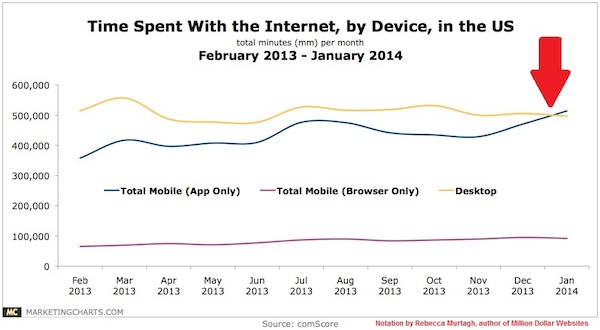
As of 2014, mobile overtook desktop as the primary device people use to access the internet, which means desktop should no longer be the only thought web designers and marketers have when developing a website. Google’s new algorithm encourages businesses to think about mobile first.
However, there’s a knowledge barrier when it comes to creating a mobile-friendly website. What do you do first? Unfortunately, the mobile web development space introduces a layer of complexity that can be difficult for some business teams. Developing websites that are mobile-friendly is more than just cross-browser; it’s about cross-platform. We’ve collected 9 tips below to give you a hand on creating a more mobile-friendly website.
9 tips on making your website easily accessible on mobile devices
Tip #1: Don’t make a separate mobile-friendly website
In the past, when we designed websites for the “mobile web,” we would cut out content to fit for mobile use and argue which parts are more suitable for mobile. However, we can’t control what kind of content our users want, and we can’t say that mobile devices are so fundamentally different from our desktops that mobile has to have its own web space.
Last time I checked, there’s only one Google, and if Google penalizes us for duplicated content already, then having two websites—one for mobile and one for desktops—with the same content defeats the purpose of trying to show up on Google’s search engines. So you shouldn’t create a separate website for mobile.
Tip #2: Use responsive design
Responsive design allows website developers to create a site that will be easily viewable on different sizes of devices. This reduces the amount of work website developers have to do when it comes to creating a website.
The responsive design approach makes use of flexible layouts, flexible images, and cascading stylesheet media queries. When responsive design is used on a website, the web page will be able to detect the visitor’s screen size and orientation and change the layout accordingly.
Tip #3: Always include a viewport meta tag
The viewport is a virtual area used by the browser rendering engine to determine how content is scaled and sized. Which is why it’s a critical code when building a multi-device experience. Without it, your site will not work well on a mobile device. What the viewport meta tag tells your browser is that the page needs to fit the screen. There are many different configurations that you can specify your viewport to control. Here’s what I recommend in using at the head of the document (this only needs to be declared once):

Tip #4: Font sizes and button size matters
Your font size and button sizes matter a lot for mobile devices. For font size, it should be at least 14px. This may seem big, but instead of having your users zoom in to read your content, make it easier for them by adjusting your font size for maximum legibility. The only time you should be going smaller, to a minimum of 12px, is on labels or forms.
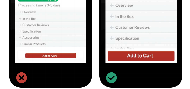
As for buttons, the bigger the button, the better—it reduces the chances that the user will miss it or hit the wrong button by mistake. For example, Apple’s design guidelines recommend button sizes to be at least 44px by 44px. Following these guidelines will help you maximize your user’s experience on their mobile device and increase conversions for e-commerce sites.

Tip #5: Use high-resolution images
Just like on Instagram, hi-res images are extremely important on your responsive websites to ensure your user’s experience is of a high standard. The latest models of iOS devices have high-definition screens that require an image double the resolution of a desktop. Having extremely high-resolution images will help you avoid having pixelated or even blurry images when viewed on a retina-quality screen.
Tip #6: Remove the default zoom
Auto-zoom can really mess up your layout elements, especially for images and navigation content. They may appear small or too large in your layout. To remedy this, use the viewport meta tag to set up custom variables within the content. Make sure you include this tag in your <head> HTML.

Tip #7: Use YouTube videos on your site
If you use a lot of videos on your site, the way your video is viewed on mobile will be very different and can sometimes be difficult. Using YouTube videos is a solution to combat any difficulties in viewing videos on mobile. The reason for this is that the embed code on YouTube is already responsive. This saves you multiple steps in making sure that your videos are mobile-friendly.
Tip #8: Don’t constrain your user’s mobile experience
No matter how beautiful your mobile website is, always include a “go to full website” or “view desktop version” option at the bottom of your site. Some people still prefer the full site experience and if they do, why constrain them from experiencing it? Especially if that’s what they prefer. The last thing you want to do is lose a potential new customer just because you stopped them from experiencing your full site, right?
Tip #9: Never stop testing
Once you’ve created your responsive website, test it, test it for the second time, and then test it again. I don’t just mean “try it on one mobile device multiple times;” test it out on an iPhone, an Android, a Windows phone, and different tablets. Test every page, user action, buttons; and while you’re testing, it’s always important to put yourself in the position of the user, or ask someone who didn’t design it to test it for you.
I hope these tips provide you guidance into knowing how to make your website more mobile-friendly. With one of the biggest digital marketing trends of 2015being mobile, there’s no reason for you to not to set your business up for mobile success.
Your website isn’t the only thing that needs to be mobile friendly. Make sure your social media management is, too!
Download the Hootsuite mobile app.
Written by
Kristina Cisnero | Kristina is Hootsuite's Inbound Marketing Specialist. Each day she focuses on bringing small businesses valuable content on social media marketing.
Thanks for the article. I found it helpful to know what to look for when designing a mobile site.