By
Evan LePageDesign is an essential part of all the content you produce, from your blog posts to your Tweets. It’s also one of the most challenging, especially for those among us who aren’t designers, and can’t afford to hire one. We try our best to create things that are visually appealing but also effective in their purpose. But sometimes, we just miss the boat.
At Hootsuite, content writers work with a talented team of design Owls, who aren’t afraid to tell us what they really think. We will often take a crack at design on content projects before the pros get involved, and their feedback on some of our questionable choices usually makes for valuable (if ego-bruising) lessons. Here’s what they’ve taught us, pulling no punches:
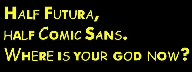
Your taste in fonts sucks

Image by Nick Douglas via flickr
You work hard on your content, so you don’t want it to go to waste. Choosing a font that’s difficult to read if probably the easiest way to do just that.
Make sure you choose fonts that work wherever someone is reading your content, be it on a giant display or a tiny phone. The most appropriate means of doing this is to mobile optimize your web properties. If this isn’t an option, at least ensure that the fonts you use are clear and readable on phones and tablets.
“Choosing a typeface that matches the message you are trying to convey is equally as important to the message itself.” – Daina Lightfoot, Hootsuite Designer
Also, double check that your fonts are web-safe fonts, so that you don’t encounter issues with fonts not appearing in certain browsers.
I’ve already seen every stock photo you’ve ever used
We all use stock images. It’s almost inevitable. On a whim one day you decide to write something about lego blocks being a business metaphor and you just don’t have lego in-house (you probably should, but anyways). That’s fine. But for your regular day to day content you should really, really be making an effort not to use stock photography.
If you can’t afford a professional photo shoot, there are innumerable photo taking and editing tutorials online that will help guide you through the process. Take a lot of photos at one time, edit them and then use them for your content over a month or even several months. The positive impact this will have on your social media content and web content cannot be understated. Good, relevant photos change everything.
“Great brand photography speaks to the brand without having the logo present. For example, Apple, The Gap, and Calvin Klein do a great job of this. A good rule of thumb: ‘Is it distinct enough that people could parody this on SNL?'” – Briony Crane, Hootsuite Art Director
Would you Instagram filter your real life?

Good for sunsets, not your product. Image by Rosa Say via flcikr
On a similar note, Instagram filters are great for a lot of things. They’re good for making bad photos look bearable. They’re good for adding a little light to a darker shot. And they’re great for editing the photos you’re actually going to post on Instagram.
What they aren’t good for is editing any and all of your social media and marketing photos.
Too many businesses rely on filters as a means of ‘editing’ their photos. In reality, many of these filters darken photos or skew certain colours or tones. In content marketing clarity is key, and often Instagram filters provide the opposite.
This is not to suggest that you shouldn’t use Instagram filters. But you shouldn’t use them as a crutch. Using unfiltered photos is probably a best practice, while filters can be used sporadically for effect.
Your content has more calls to action than content
Calls to action are an essential part of content marketing. You invest time in content hoping that it will help you achieve your business goals, and your CTAs are what link those two elements together. But you can never forget that content is still what drove a person to your blog or page. If you promise content but deliver CTA-riddled copy, you’re going to lose your visitors fast.
In general, your content should have a minimal number of calls-to-action. Ideally, it would only have one. The less calls to action you have on a page, the more likely your visitors are to click on your one button anyways. If there are five buttons leading to five different deals or content assets, you’re going to scatter and confuse people.
“A CTA is kind of like throwing a ball at somebody. If you throw three balls at the same time, they probably won’t catch any. Make one really good throw.” – Shawn Parkinson, Hootsuite Designer
Plus, a page full of buttons just isn’t aesthetically appealing. Try and keep your CTAs consistent—one colour, one size and one style—so people notice them more easily.
Your website blinded me

Huh? Image by Jonas Ahrentorp via flickr
Visitors are a huge commodity today. When your content ends up on someone’s screen, through social media, your website or any other means, you want to make the most of that opportunity. Unfortunately, people react to this by shoving as much information as possible into their design.
Yes, your business provides seven different services and you want people who visit your website to know that. But listing those services, each with it’s own description, price, image, video and link on the same page almost ensures that nobody is going to click anything at all. More content doesn’t mean more effectiveness. In fact it’s often the opposite.
Less is more. Strive to put only the essentials on the pages that you design.
“If I’m doing a client’s website, for instance, I’ll usually ask them to prioritize the top 2-3 things they want the site to do or say, and focus on that, rather than trying to say everything all at once.” — Mark Stokoe, Hootsuite Designer
Instead of putting your seven services on your home page, try including an appealing image with one call-to-action, something like “Learn more about the comprehensive services we provide.” This will probably result in a better-designed webpage, and one that is more effective at driving customers through your funnel.
And always remember: white space is your friend.
Hootsuite CEO Ryan Holmes wonders “Is Bad Design Wrecking Your Great Business?” Check out his design tips here.
Written by

Evan is a Blog Specialist for Hootsuite. He writes features, news items, releases and all things Hootsuite.
Related articles


